
In teaching in higher education, presentations accompanied by slides are a typical teaching method, i.e. in a lecture, student presentation or in the presentation of work results. Often, the quality of the presentation suffers from awkwardly designed presentation slides: some are more of a hindrance to the learning process than a support.
In this post, we would like to present five mistakes often made in the design of slides. You will also receive evidence-based recommendations on how to avoid these mistakes.
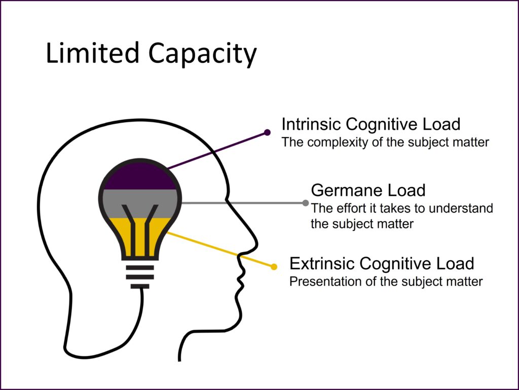
Slides serve to make content clearer and support a presentation. In doing so, it is important to design presentation slides in such a way that information absorption is made easier without unnecessarily increasing the cognitive load needed to process the slides (Paas & Sweller, 2014). The Cognitive Theory of Multimedia Learning by R.E. Mayer (2014) points out which design principles are especially suitable.
1. Text-heavy layout
One of the most common mistakes made in the design of slides: the slide is filled exclusively with text (see. Figure 1). This often happens when text is copied and pasted 1:1 from a script into a slide. Often slides are even deliberately filled with generous amounts of text because the presentation slides are also used as handouts for the students.

Studies show that contents are easier to understand when an appropriate graphic is included than when text alone is presented (Multimedia Principle; Mayer & Moreno, 2003). Pay attention, therefore, to the following recommendations when designing slides:
- Use graphics wherever possible.
- Make particular use of suitable graphics: inappropriate graphics lower the likelihood of learning compared to text slides.
- Use visual advance organisers (including to activate relevant concepts in long-term memory).
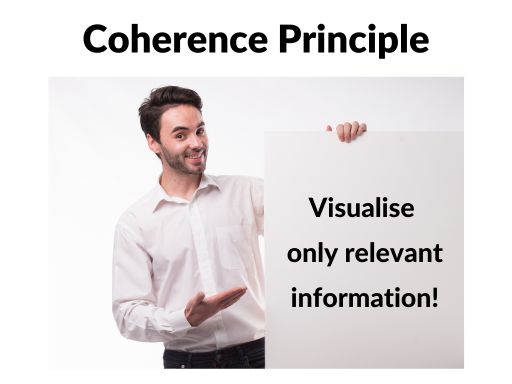
2. Presentation of irrelevant contents
Another mistake is the presentation of irrelevant content (see Figure 3). This may include
- constantly displayed elements (e.g. the university’s logo, the date of the presentation, the name of the professorship, the current slide number …),
- complex tables or diagrams in which only some selected results are important,
- text in decorative fonts and/or with animation or
- eye-catching, “playful” slide designs.

You make it easier for your students to understand when you remove material and information which is unnecessary for comprehension but merely distracts (Coherence Principle; Mayer & Moreno, 2003). For implementation, use the following list as orientation:
- Keep your visuals as simple as possible.
- Do not add any graphics which are merely decorative.
- In formulating text, use nominal style or bullet points when possible.
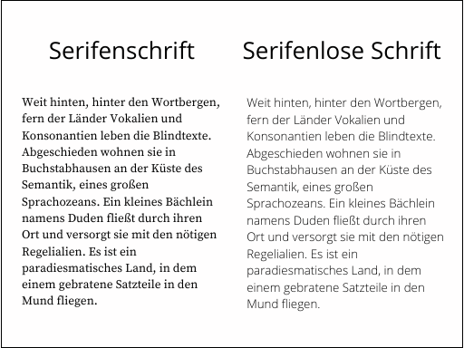
- Pay attention to legible text (good contrast, serif-free, sufficiently large, no decorative fonts).
- Avoid animation – only use this when it is really useful.
- If possible, avoid including continuously-displayed elements (e.g. logo, name) and the footer (e.g. date, slide number) on all slides. Tip: Use the title slide for providing relevant formal information.
- Make sure that the slide design does not distract from the content.
- Pay attention to a uniform, harmonious colour scheme. Ideally, limit yourself to three or four colours for your presentation.
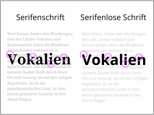
3. A lack of visual cues
A mistake which is very easily avoided but often made on slides is a lack of visual cues (see Figure 5). This refers to noticeable references to central aspects, e.g. in the form of arrows or circled or highlighted text.
You can support meaningful learning by visually highlighting central ideas in the design of your slides (Signaling Principle; Mayer & Moreno, 2003):
- In order to visually emphasise textual elements, you can mark the corresponding text sections in colour, bold the text or highlight it. By using coloured markings, limit yourself to one colour, if possible.
- If you would like to emphasise graphical elements, you can use arrows, for example, or circle or frame the corresponding area.
- Alternatively, you can shade out irrelevant elements (e.g. in an animation).
- Regardless of the variant you choose: ensure that the emphasis is always implemented the same way on all slides.
4. Speaker text = slide text
Mistake number 4 on our list of common mistakes is to present identical contents both in the form of slides and as spoken text (cf. Video 1):
Students learn better when you do not offer them an identical text simultaneously in written and spoken form (Redundancy Principle; Mayer & Moreno, 2003). Always keep in mind that the slides are meant to be a visually supportive accessory to your oral explanations. They are not meant to replace your presentation!
Ideally, you should also consider the following points:
- Do not simultaneously present identical contents as slide text and oral presentation: written text on slides “displaces” spoken text.
- It is better to orally explain graphics or animations than with written text on the slide.
5. Awkward placement of contents
One last mistake which is often seen on presentation slides is: diagrams contain a legend and graphics have an explanatory heading, but these elements – which really belong together – are positioned far apart from one another on the slide (cf. Figure 7).

Sie unterstützen Ihre Studierenden bei der Aufnahme und Verarbeitung der Inhalte, wenn Text und Grafiken räumlich nah beieinander platziert sind (Prinzip der räumlichen Nähe; Mayer & Moreno, 2003).
You can support your students in absorbing and processing contents when text and graphics are positioned close to one another (Principle of Spacial Proximity; Mayer & Moreno, 2003).
In doing so, ensure that labelling is positioned close to graphics, diagrams and charts and – if possible – it is even better to place labels in an appropriate place in the image.

Conclusion
Ultimately, with a reasonable amount of effort, even existing slides can be improved – this investment is worth it. The following quote has been attributed to Steve Jobs: “People who know what they’re talking about don’t need PowerPoint.” We wouldn’t let this statement just stand as it is: Teachers who know how to design slides to support learning can definitely use PowerPoint (or any other presentation tool).
For more depth, we recommend the Cambridge Handbook of Multimedia Learning, edited by Richard E. Mayer (2014). There, you can find comprehensive explanations of the underlying theories, as well as the principles of multimedia learning discussed above (including their evidence).
At this point, we would like to refer you to the workshops “Designing Slides for Academic Presentations” offered by the ZHW in which you can deepen your knowledge and competencies in the creation of presentation slides to support learning.
References
Mayer, R. (Ed.). (2014). The Cambridge Handbook of Multimedia Learning (2nd ed., Cambridge Handbooks in Psychology). Cambridge: Cambridge University Press. doi:10.1017/CBO9781139547369
Paas, F., & Sweller, J. (2014). Implications of Cognitive Load Theory for Multimedia Learning. In R. Mayer (Ed.), The Cambridge Handbook of Multimedia Learning (Cambridge Handbooks in Psychology, pp. 27-42). Cambridge: Cambridge University Press. doi:10.1017/CBO9781139547369.004
Suggestion for citation of this blog post
Bachmaier, R. (2022, January 27). 5 Typical Mistakes in Slide Design (and how to avoid them). Lehrblick – ZHW Uni Regensburg. https://doi.org/10.5283/zhw.20220127.en

Regine Bachmaier
Dr. Regine Bachmaier is a research associate at the Centre for University and Academic Teaching (ZHW) at the University of Regensburg. She supports teachers in the field of “digital teaching”, among other things, through workshops and individual counseling. In addition, she tries to keep up to date with the latest developments in the field of “digital teaching” and pass them on.