
You would be unlikely to find any scientific publication or lecture that dispensed with presenting data. This data is frequently visualised – i.e. it is represented graphically. The art is to find a form of presentation that is clear and understandable without running the risk of the readers interpreting the data in the wrong way.
What story do you want your data to tell?
A good graphic representation offers a clear, visual message that is easy to understand and doesn’t raise any questions or cause confusion. So the first step is to think about what data is important so that you can substantiate what you are saying. Ask yourself this question: “If I left out this information or that number, would it change anything?”. If the answer to that is “no”, take the information out. When you choose the data, take into account your target audience and their previous knowledge as regards interpreting data visualisations.
Once you have selected the relevant data, the second step is to consider how to present it in a suitable way.
Decide on a suitable form of representation.
There are many ways to create visualisations (see Schwabish, 2021; Nussbaumer Knaflic, 2017, for a detailed overview). Depending on the data to be presented, the target audience and the aim of the visualisation, decide on a suitable visual form of representation, e.g. a table, graph, map or mind map. Do you want to present the development over a certain time period? If so, a line graph would be a very good option. To represent processes or sequences, a flow chart would be a good choice, for example. There are various online tools to help you choose suitable visualisations, e.g. The Data Visualisation Catalogue or Data Viz Project. Use forms of representation that your target audience are familiar with, like bar charts and line graphs, for example.
Present your data in a way that is easy to read.
The standard output delivered by Excel, SPSS, Numbers and Tableau, etc. is often not ideal, so review each visualisation with regard to its clarity and conciseness and adjust it if necessary.
Pare down your visualisations.
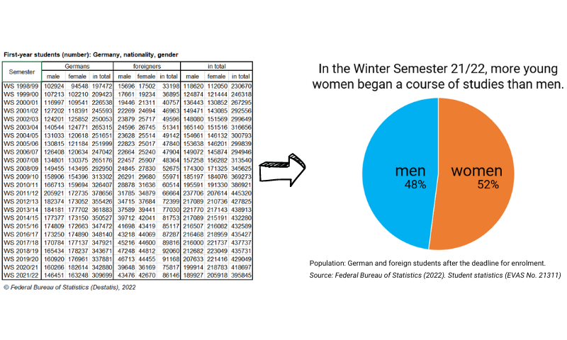
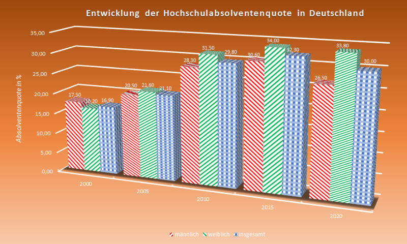
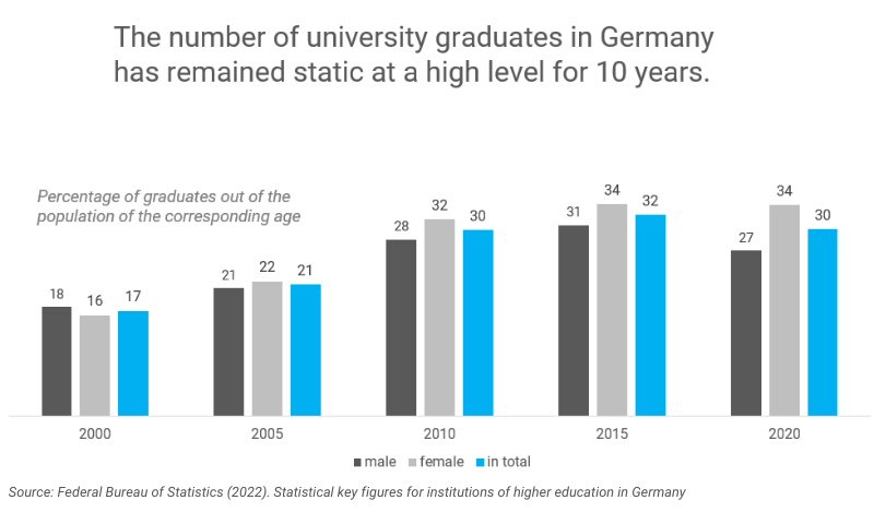
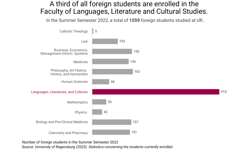
You have probably already come across graphs that look like Figure 2. Instead of making it easier to understand the data presented, its structure makes it harder. If you incorporate the recommendations suggested below, you will get a clear visualisation that is easy to understand (see Figure 3).
Take out irrelevant elements so as to direct the focus onto the information that is important: avoid dominant gridlines and borders in charts and tables. Gridlines can often be left out completely or can alternatively be formatted in a light colour. Borders are often unnecessary as well.
Work the chart axes so that the data shown and the tick marks aren’t too granular: decide whether you need to show the values as axis labels complete with their decimal places, for example. The same applies to tick marks: check whether the marks inserted in the standard output have been placed in a way that makes sense – the markings are often too detailed. Reducing a visualisation to its essence will improve its quality. You can also explicitly use empty space (white space) as a separator.
Graphic effects generally make a visualisation harder to read. 3D visualisations are the biggest nuisance. Not only are they hard to understand but the visual perception of the figures becomes distorted as well. Shading, gradient colours and patterns, etc., are unsuitable for both the background and the graphic elements of a visualisation. Avoid making the background a certain colour or inserting a graphic backdrop.
Finally, have a look at the labels and data markers. Shorten elements that are too long, redundant or superfluous, or remove them altogether.
Direct your readers’ attention.
Preattentive features are visual features of objects that our brain perceives quickly and automatically without our having to pay attention to them consciously (Nussbaumer Knaflic, 2017). These include size, shape, colour and contrast, for example. Use these features to direct your readers’ attention towards certain elements of a visualisation, such as by making the text bold, using a border or highlighting an element in colour.
At the same time, you can use this to order the contents visually and lead the readers through the information in the order you intended.
Take advantage of the direction your readers usually read in: in the first step, visualisations are skimmed over in a zigzag from top left to bottom right. Place important information in the top part of the visualisation and sort the data if the contents allow (e.g. in descending order).
Consider the colours you use carefully.
Schwabish (2021, pp. 44 f.) recommends first creating a version of the visualisation that is formatted completely in grey and then putting specific relevant values in colour step by step (although only adding colour sparingly overall).
When choosing colours, make sure you use those that are clearly distinguishable from one another. If you are not bound by certain colour stipulations, it is best to use colour palettes that can be recognised by people who are colour blind (see the recommendations of Shaffer, 2016, in this regard). One very suitable colour combination is orange and blue instead of red and green, for instance. You should also consider the connotations that colours have (e.g. red often has negative connotations and green has positive ones) and the mood that a colour conveys. Avoid using the rainbow palette. You can find harmonious colour palettes with coordinated colours at https://farbenpalette.com, for example.
Regardless of the colours you decide on: always use the same colours for recurring features.
Incorporate text into the visualisation.
The following applies as a matter of principle: use straightforward language and avoid acronyms. Choose a font that is easy to read.
In order for a graphic representation to be reader friendly, it’s important that it has a title. This should summarise the key message of the graphic representation and direct the reader’s attention to the data that follows. Formulate the title for it in the style of a newspaper headline. If necessary, you can add in a subtitle as well. Position footnotes or additional information – e.g. regarding the source or special characteristics of the data – below the graphic representation.
As a rule, each axis on a chart should be labelled. However, you can deliberately make an exception here if the relevant information can be gleaned directly from the chart. Nussbaumer Knaflic (2017) suggests labelling data series directly in the chart as an alternative to including a key. As an additional tip, she recommends formatting the labels in the same colour as the data.
You can specify values by naming the end point of a bar or line. If you would like to communicate information on the context or conclusions, insert these in the chart right next to the respective data.
Conclusion
Don’t leave the creation of your visualisations up to chance or the software. Make concrete decisions and use the checklist “Rate My Visualization” by Stephanie Evergreen for your final check.
References
Nussbaumer Knaflic, C. (2017). Storytelling mit Daten. Die Grundlagen der effektiven Kommunikation und Visualisierung mit Daten. Verlag Franz Vahlen.
Schwabish, J. A. (2021). Better Data Visualizations. A Guide for Scholars, Researchers, and Wonks. Columbia University Press.
Shaffer, J. (2016, 20 April). 5 Tips on Designing Colorblind-Friendly Visualizations. https://www.tableau.com/blog/examining-data-viz-rules-dont-use-red-green-together
European Environment Agency (2021). Dos and don’ts of data visualisation. Usability guidelines for improving your visualisations. https://www.eea.europa.eu/data-and-maps/daviz/learn-more/chart-dos-and-donts
Suggestion for citation of this blogpost
Bachmaier, R. (2023, January 12). Discover the power of visualisation: How to present data so that it is understandable Lehrblick – ZHW Uni Regensburg. https://doi.org/10.5283/ZHW.20230112.EN

Regine Bachmaier
Dr. Regine Bachmaier is a research associate at the Centre for University and Academic Teaching (ZHW) at the University of Regensburg. She supports teachers in the field of “digital teaching”, among other things, through workshops and individual counseling. In addition, she tries to keep up to date with the latest developments in the field of “digital teaching” and pass them on.