“Teaching material must be formulated in a comprehensible way. Everyone agrees with this demand and yet the complaints about difficult texts never end.” This statement from Steffen-Peter Ballstaedt (1991, p. 19) is more than 30 years old but is still up-to-date: technically it is no major problem for most instructors to generate learning texts (i.e. texts provided to students as learning material) and to post them online. In view of the content, language and visual design, however, there are often uncertainties. For that reason, we would like to give you four basic recommendations for designing comprehensible learning texts as well as tips for their technical implementation.
Whether and to what extent students understand a learning text depends on many factors. One is the design of the text to support learning, i.e. whether you design your learning text in such a way that it makes it easier for students to absorb the information without unnecessarily increasing their cognitive load in processing the information (Paas & Sweller, 2021). In short: design your learning text in a legible and easy-to-understand way (cf. the comprehensive information on leserlich.info).
1. Offer your readers structure and orientation
A good learning text presents the context in an organized form, creating structure. Use the following options to offer your reader orientation:
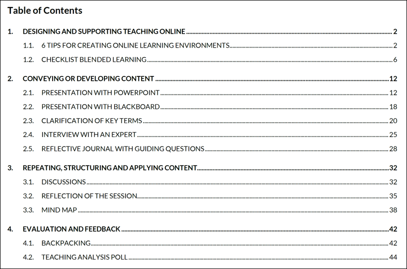
Table of contents: The table of contents makes it possible to grasp the structure and topics of the learning text at a glance. Here, it is important to pay attention to an appropriate visual presentation as well as to the granularity of the contents listed.

Advance organizer: Similar to the table of contents, an advance organizer makes it possible to get an overview of the structure and topics of a text. An advance organizer offers a pre-structuring of the text to follow. Unlike the table of contents and the summary, it also attempts to encourage readers to make use of prior knowledge. Graphical forms of the advance organizer are also possible.
Summaries: Summaries are absolutely essential for texts which are larger in scope. They bundle the most important content and can be included at various points in the text: the most important statements can be included as a summary at the end of the text or as an intermediate summary in longer texts. As an alternative to the advance organizer, a summary can be provided as an overview of the text itself. Summaries can also be provided in graphical form.
Comprehensible ordering of contents: When creating the text, you must decide on a certain order for the contents. You should be able to establish an order that allows the readers to follow the thought process. Some topics include an appropriate order from the start, while didactic skills are needed to appropriately order other contents (cf. the comprehensive discussion by Arzberger & Brehm, 1995, chapter 3).
Meaningful headings: Headings are an excellent means of clarifying the structure linguistically and visually. The typographical highlighting of headings interrupts the flow of reading and thereby gives the reader an opportunity to repeat or activate their prior knowledge. You can use headings to introduce or summarize the topic of the following section.
Lists: Take advantage of the opportunity to make lists visually apparent in learning texts using bullet points or numbering.
2. Use simple language
Alongside the organized presentation of the content, the second most important prerequisite for the comprehensibility of a learning text is the use of simple language. When you compose your text in simple language, the readers can quickly grasp the words and create connections between them within a sentence. Simple language includes:
Easy-to-understand sentence structure: It is not necessary for a text to consist only of main clauses. You can use compound sentences. However, make sure to avoid overly complex sentence structures. This includes long sentences in which multiple insertions and subordinate clauses are placed within one another. Dissolve these complicated sentences by creating multiple, more understandable sentences instead. Like complex sentences, you should also avoid nominalisations.
Clear textual references: Make an effort to create coherence within the text. Use the following recommendations for orientation:
- Use conjunctions (“but”, “or”, “because”, “rather”) in order to create coherences between sentences or clauses.
- When using pronouns, make sure it is clear to your readers what each pronoun refers to. (“The situation of the political party is difficult. It is full of disputes and controversy”. > What is full of disputes and controversy – the situation or the political party?).
- Explicitly refer back to previous information in the later course of the text, in order to encourage readers to recall it (“The question posed at the start as to … can be answered as follows.”; “Below, the term ‘blended learning’ introduced in section 1.3 will be discussed further in order to …”)
Common vocabulary: Only use synonyms when these are known to the readers of your learning text. When using jargon, check to what extent you need to explain them. It may make sense to include a glossary for technical terms.
Stimulating rhetorical means: Make an effort to formulate the text in as interesting and as non-abstract a way as possible. This can be achieved by using e.g. vivid vocabulary, rhetorical imagery (metaphors, comparisons) and illustrative examples (cf. the comprehensive discussion by Ballstaedt, 1994, S. 46ff). Furthermore, pay attention to gender-neutrality (cf. the recommendations from the web portal genderleicht.de).
3. Design the page layout and font to be read-friendly
The most important recommendation in this context is as follows: throughout the document, pay attention to consistent layout for the pages and embedded elements. For example, contents on every page should have the same borders, text should always be emphasized in the same way (e.g. through bolding) and the page number should always be in the same place. Also pay attention to the following points:
Page layout: The text should have a generous border. Often the right border is extra wide. This allows the readers to note comments or sketches.
Font: Not all fonts are equally legible. Some make it harder than others to distinguish between letters and words. In longer texts, this can lead to more frequent misreadings, slower reading speed and/or a decrease in reading motivation. Aside from the selection of an appropriate font, aspects such as font size, line thickness, character spacing, line spacing and contrast are relevant for the legibility of a text. Comprehensive information on the selection of easily legible text design (including very illustrative examples of each aspect) can be found on the website leserlich.info.
Emphasizing important or special content: Visually emphasize particularly important text elements, e.g. summaries, sentences for memorisation or examples. For this, use boxes, coloured backgrounds or the possibilities for textual emphasis (“Signaling Principle”; Fiorella & Mayer, 2021). Ensure that such emphasis is used consistently and use these techniques in a targeted way.
4. Include visualizations
Mayer (2021) summarizes various studies which show that the learning effect is greater with a combination of written text and images than when a topic is described only with text.
In order to allow your readers to make full use of your learning text’s potential, pay attention to the basic principles of multimedia design (cf. the comprehensive discussion by Fiorella & Mayer, 2021):
- Keep visualizations as simple as possible.
- Position the title close to the graphic or in an appropriate position within the graphic.

- For the visualization of data, use an appropriate diagram. The website Data Viz Project can help you in this decision.
- When using icons, be sure to use known symbols. You are certain to find something on the web portal “Noun Project”.
5. Use format templates
All common word processing programs offer pre-defined templates e.g. for headings, lists and borders. Use these templates to design your learning text. This offers you various advantages. You can create a table of contents for your learning text with just a few mouse clicks. The entire document automatically appears in a unified layout. That way e.g. all headings of the same rank have an identical appearance, and the line spacing of the prose text is the same throughout. When you make alterations centrally in the formatting template, these automatically affect all of the correspondingly formatting elements within the documents: e.g. if you change the font size for “Heading 1” in the formatting template, all first level headings are updated in your document.
Your text will also take a big step towards accessibility (the post “Three Simple Tips for Accessible Instruction in Higher Education” has comprehensive information in this regard).
We would love to receive feedback about how useful these tips were for you. Please use the comment function.
References
Arzberger, H. & Brehm, K.-H. (Hrsg). (1995). 4. Aufl. Lerntexte in der Weiterbildung. Gestaltung und Bewertung. Publicis.
Ballstaedt, S.-P. (1994). Lerntexte und Teilnehmerunterlagen (2. Aufl.). Beltz.
Fiorella, L., & Mayer, R. (2021). Principles for Reducing Extraneous Processing in Multimedia Learning. In R. Mayer & L. Fiorella (Eds.), The Cambridge Handbook of Multimedia Learning (Cambridge Handbooks in Psychology, pp. 185-198). Cambridge University Press. doi:10.1017/9781108894333.019
Mayer, R. (2021). The Multimedia Principle. In R. Mayer & L. Fiorella (Eds.), The Cambridge Handbook of Multimedia Learning (Cambridge Handbooks in Psychology, pp. 145-157). Cambridge University Press. doi:10.1017/9781108894333.015
Paas, F., & Sweller, J. (2021). Implications of Cognitive Load Theory for Multimedia Learning. In R. Mayer & L. Fiorella (Eds.), The Cambridge Handbook of Multimedia Learning (Cambridge Handbooks in Psychology, pp. 73-81). Cambridge University Press. doi:10.1017/9781108894333.009
Suggestion for citation of this blog post
Bachmaier, R. (2022, April 21). 5 tips for creating comprehensible learning texts. Lehrblick – ZHW Uni Regensburg. https://doi.org/10.5283/ZHW.20220421.EN

Regine Bachmaier
Dr. Regine Bachmaier is a research associate at the Centre for University and Academic Teaching (ZHW) at the University of Regensburg. She supports teachers in the field of “digital teaching”, among other things, through workshops and individual counseling. In addition, she tries to keep up to date with the latest developments in the field of “digital teaching” and pass them on.


